
Brand & Style Guide
The purpose of this guide is to give you the tools you need in order to represent TeachBeyond in an appropriate and consistent manner. Style and branding guidelines are essential to creating and maintaining a professional and respected presence around the world.
The Logo
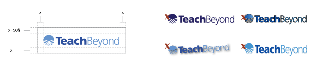
This is the primary version of our logo. It uses two shades of blue along with our tagline underneath. The logo without the tagline can be used if the tagline is already featured elsewhere on the piece or if it will become illegible at the small size. Download the TeachBeyond Logo >>

Logo usage
To maintain the integrity of the brand, there are a few rules to keep in mind. Rotating, recoloring, or distorting the logo in any way compromises the logo. Please do not add any embellishments to the logo, such as an outline, drop shadow, or other decoration.
Color palette
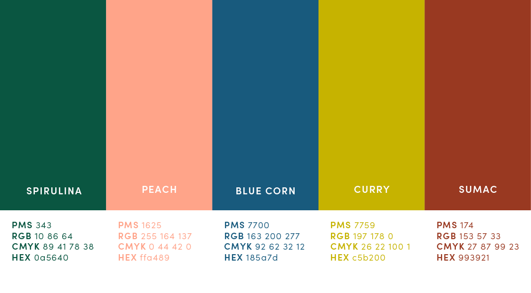
Our palette reflects the spirit of TeachBeyond. Utilizing bold and modern colors that are found around the world. Color names were chosen to playfully honor foods from different cultures.
Our Typefaces
Typography is a great tool when used consistently. The typefaces for both headlines and body copy best represent the approachable, clear, and global feel of our organization. These font families should be used across all print & web. If Sofia Pro is unavailable, Century Gothic is the preferred alternative, which comes pre-installed on both Windows and Apple computers.
